
After an email from a teacher about creating posters with less colour to cater to students with Autism and ADHD. It was an eyeopener because my posters have always been so colourful and I never considered that this could create difficulties for some students. After researching what changes I could make to make my designs more accessible, I designed these poster sets with features to help students with autism, ADHD, dyslexia and other learning difficulties.
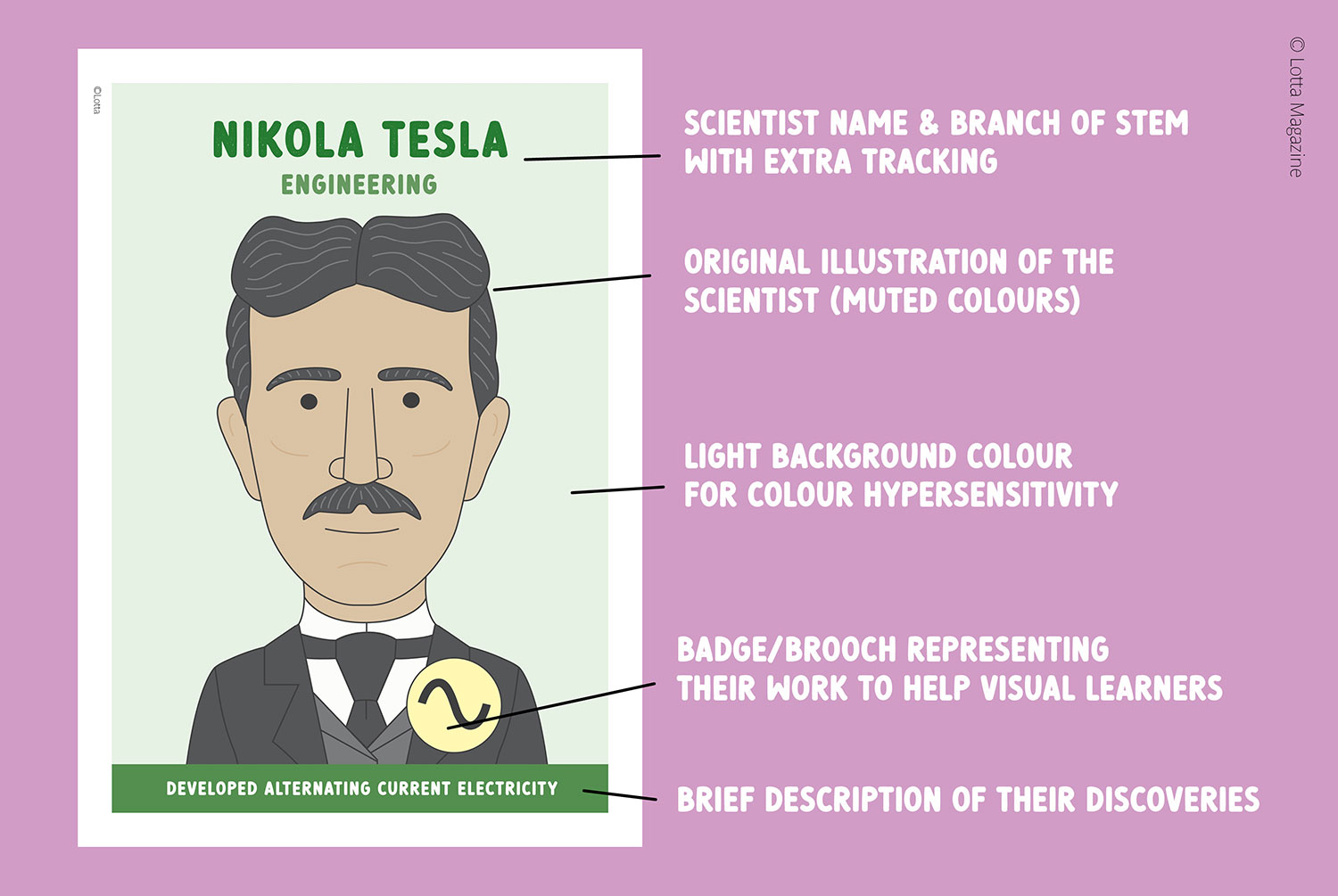
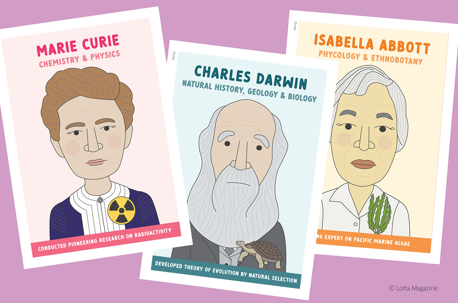
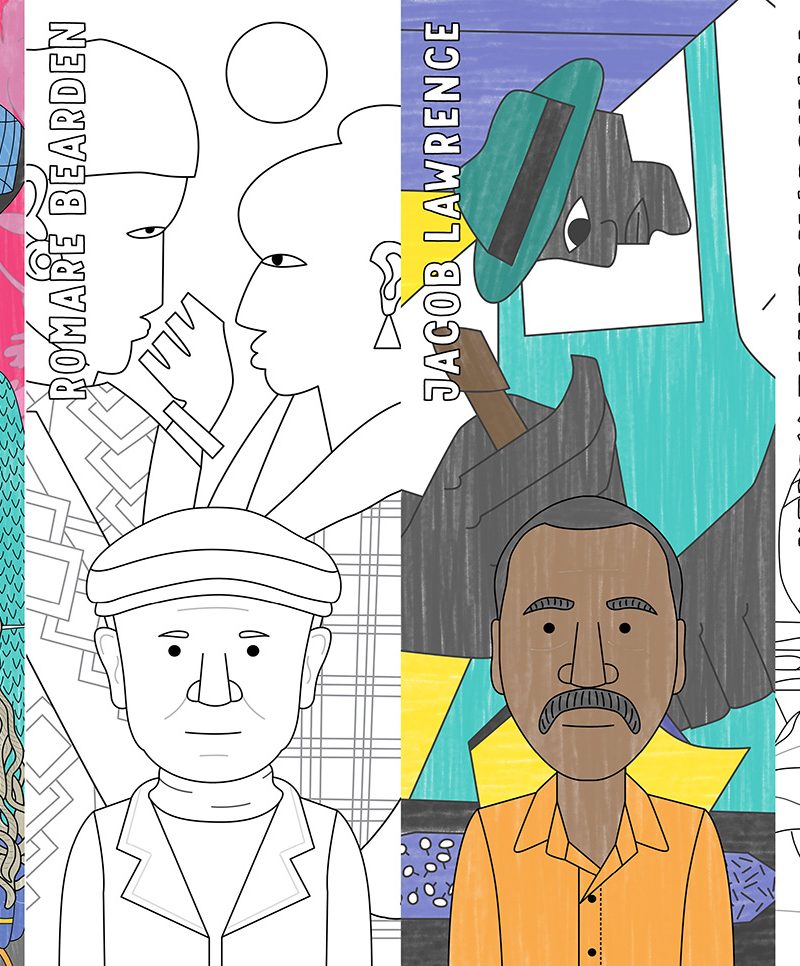
The new famous artist and famous scientist poster sets have some subtle but important changes to make them more accessible and useful to neurodivergent people.
- The font used has good legibility, is sans serif, has basic recognisable letterforms and has added tracking (space between letters) to help dyslexics.
- Font size is larger on this poster series. There is also extra line spacing.
- A softer, more muted pastel colour scheme which is often preferred by those with ADHD and learning disabilities as they are less triggering and distracting.
- Lighter background colours for those with hypersensitivity to color.
- The backgrounds are not white as that can be distracting or cause symptoms for some and make legibility difficult for others.
- Good contrast levels between the background and the text.
- All the posters have a clear visual hierarchy to aid comprehension for everyone. There is also consistency in the design layout throughout all the posters.
- I have checked the designs through a colour-blindness simulator to make sure that none of the important details are lost with different types of colour-blindness.
- As with all the posters in this series the information is presented in clear, bite size chunks and the badges act as a memory prompt and help visual learners.
You can find all the pastel posters here:
Please let me know if there are any further changes that I can make to support everyone’s needs. My email is leonie@lottamagazine.com
Leave a Reply